The Drag and Drop editor included within Gold-Vision Connect allows a user to create a fully responsive email without any required knowledge of HTML or specialist email design. The editor is ideal for anybody to use, with easy drag and drop controls allowing you to input a modern design with call to action buttons, images, titles and a WYSIWYG text editor. We also offer the WYSIWYG/HTML editor should you prefer to directly input your HTML code and/or edit the HTML directly.
"">
To select the Drag and Drop editor when creating a new template or mailshot, please choose the Drag and Drop icon.
Note: Template and Mailshot designs cannot be moved between the two editors. If you begin a design in the Drag and Drop editor, it is not possible to move the design into the HTML WYSIWYG editor, and vice versa.
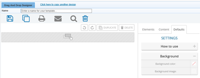
When starting a template without using a stock template, the defaults tab is a useful starting point to ensure consistency.
These options can be found on the defaults tab on the right panel.
The default background sets the background of the entire email. You can select a colour, or an image.
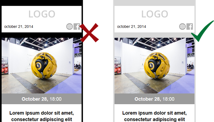
Most email clients, especially on mobile devices, will not display a large amount of the background of your email, unless you choose transparent content elements. Therefore the background setting is to provide a standardised background for the template, rather than an integral part of the design.
We recommend avoiding highly contrasting colours for your background. Large contrasts in colour can cause awkward or overtly distinct frames around content on mobile devices, where little of the background shows.
Similarly, choose background images with care. Again, it is likely that only a small portion of the image will be visable to the reader in most cases. We recommend avoiding large background images due to:
A more common use of the background image is tiling. Using a small repeatable image that resembles a material, or shows a geometric pattern.
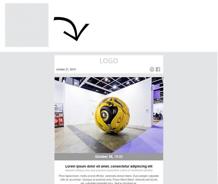
This avoids including a large image in your email, ensuring a faster load time.
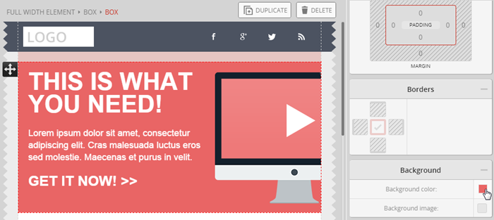
When creating a new template, there are two basic elements which give the frame to your email design: the full width element, and the box.
The first full width element (row) acts as the base of your email, and it fills the whole window of the users email client where the email is read. It is the essential element in any template, and must be used to ensure the email renders correctly.
You can add any number of full width elements to your email templates. It’s quite common to have three of within a newsletter: one for the header, one for the content and one for the footer.
If you follow this approach you can easily set different background colors for the separate parts of your email message, and give a ’website-like’ feeling to your email templates.
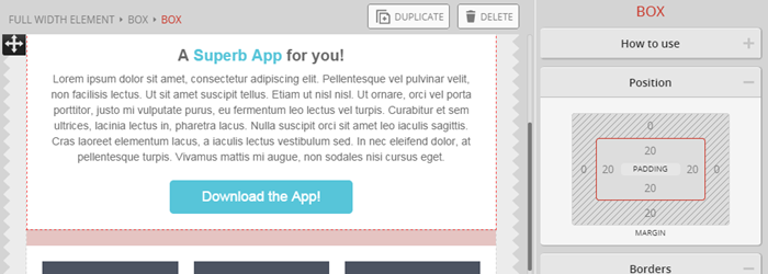
The box is a container element used to group different elements together, such as titles, text, images, tables and so on. It can also be used as a tool to give a different background colour or image (background images are not supported in Outlook, therefore ensure you also select a background colour to be used instead) for an element or group of elements.
Furthermore, the box element is used to ensure your template is responsive to the device it is read on. The box adjusts to the available width and resizes its contents accordingly.
Any element can be inserted into a box except for the full width element. Multiple boxes can be nested into each other.
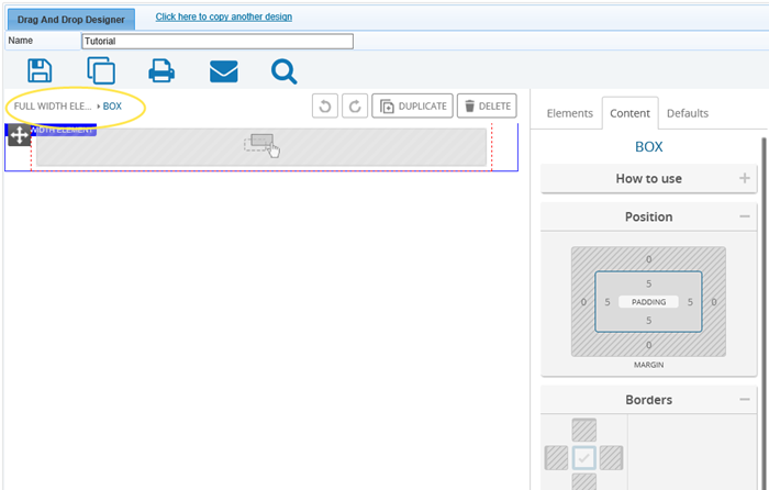
Every box has 5px padding and a transparent background by default. You can change both settings if you wish, see further information on both box elements and padding below.
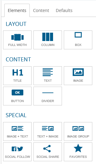
To the right side of the editor you can find the drag elements toolbox, containing the various elements to use within the template. To add an element, simply drag & drop it to the desired place in your template.
As the name suggests, the full width element fills the email window horizontally, while the height adjusts to its content. Its role is to give a full-width background to a section of your template. You can use it for headers, footers and highlights.
The box is a container element for your content. It can contain one or more elements. The box (along with the table) provides responsive capability to your template, as it adjusts to the viewing window and sets the contained elements size accordingly.

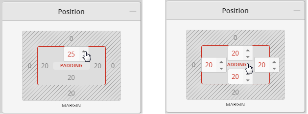
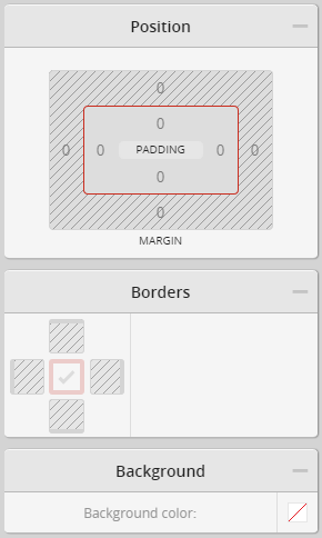
If a box has either a background or a border, it is better use spacing inside rather than outside the box. This is called padding.
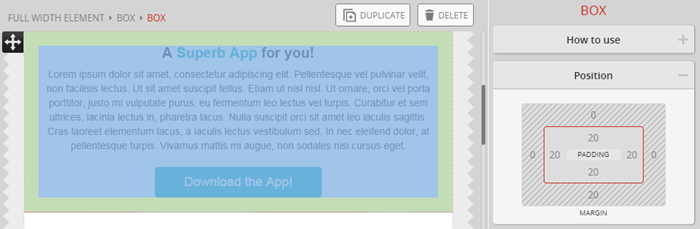
The padding thickness can be set in the position toolbox on the right. Clicking on one number allows you to set one side (left/right/top/bottom) on its own.
If you click on the PADDING label in the middle, you can set the Padding simultaneously on all sides.
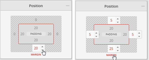
Margin is the spacing outside that separates the box from other objects.
Similar to padding, you can adjust the size of each side individually or set the overall margin altogether by clicking on the MARGIN label.
You can to set the box’s borders on each side separately or you can set the same border for all sides at once.
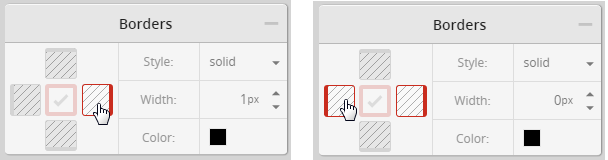
First select which side you want to set, then adjust the settings on the right.
If you click in the middle you can set all sides at once. To disable a border you can select “none” for its style, or you can set its width to 0px.
The background of a box is used to give a distinct colour background to an emphasized text or table.
The default background setting is transparent, allowing you to choose which boxes you give a background colour to.
An image can also be used as background. This is useful when you want to put text on an image, or you want to use a tiled image to have a geometric pattern or simulated fabric as the background.
When you have text over an image background, always send preview emails to check how they render in mobile and tablet views. Because of the template’s responsiveness the element’s position may change according to the viewing size and this could affect where your text sits on your image.
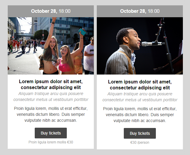
The most eye-catching parts of your template are likely to be images. In old-fashioned newsletters images often dominated the content, but in modern emails we usually see a healthy mix of stylish images and well-designed content in most responsive email designs.
Whenever you create an email template always think about the purpose of your message and align your image and text content accordingly.
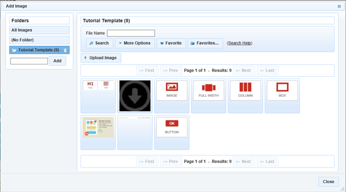
Images are not sent in your email message, instead they are linked to from the media library. That is why you upload or import images into the Media library and then insert them from there.
To access the media library, double click on the image placeholder, or push the jump to gallery button in the image toolbox on the right.
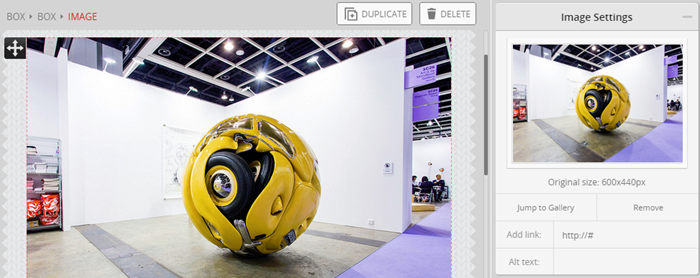
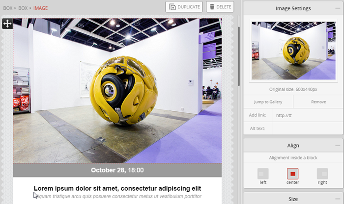
After putting an image into your email template, click on it to set the image properties. Under the preview you can add a link to the image, as well as alternative text.
Images are often used as links within marketing emails, and you can add links easily within this panel.
The alternative text (alt text) is displayed when the image is not available, such as when read in plain text. Email clients often do not display by default, only after confirmation from the user. In some rare cases images may not be displayed at all. Therefore it is good practice to input alt text describing what the image should tell to the user, or provide something to click on.
If the image size is large enough it will fill the horizontal space available and adjust its height accordingly to keep the image ratio. The space available will be defined by the container element of the image, which is usually a box or a column.
If the Image is smaller than its container, it won’t be stretched, but it will shrink if it is larger than the container.
You can reduce the size of your image by using the slider or input field in the Size toolbox.
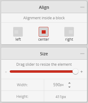
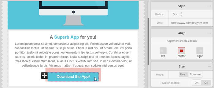
The image can be aligned inside its container element to the left, center or right.
It is important to note that the widest view of your responsive template is 600px. This means that there is no need to upload images any larger than this.
Keep in mind that the email client has to download the images to display them, and this can be a slow process if there are big files to download. This issue is increased when considering mobile internet connections. Therefore, try to minimize the size of the images you use.
The other image options can be set using the same controls as used for the box element.
When using margin for images, be aware that some email clients and mobile devices may not render the margin you have set. If you are setting an image and another item, such as text, next to each other, it may be better to place the image and text into sepearte containers with a gap between them.
If you want to create a “frame” effect around your image you can add a background colour, padding, borders and margin to have spacing between your image and other elements.
You are able to define exactly how you want your written content to be displayed in your email templates.
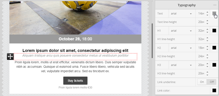
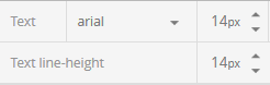
The font you use greatly influences your template style. A good rule of thumb is to stick to one or maybe two fonts – one for headings and one for content text.
The default font sizes are generally good for most templates, but feel free to change them. The bigger the text, the more easily it can be read on mobile devices.
For all text elements there is the option to change the colour and the line-height. The colour is obviously important for your style, whereas the line-height helps with the ease of reading your content.
You can determine the link style - both if it is underlined, and the colour.
Note: you can override these settings with the built-in text (WYSIWYG) editor.

You can choose from a number of web-safe fonts, some of them more classic (Times, Georgia), others more modern (Arial, Helvetica).
Most content on the web is written in Arial, as this is one of the most widely used fonts on electronic devices. It is probably the safest choice if you want to make sure your template gets displayed the same way on every device, in every email client.
Font colour is an important factor in both style and ease of reading, combined with the background of your email. Try to choose a colour combination with a comfortable amount of contrast.
Using different colours is one of the best ways of highlighting / emphasizing text, so it is easy to set a different colour for headings. The heading colours are set independently, so you can change to a different colour in every heading if you choose.
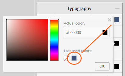
If you have already chosen a custom colour, you can select it from the ‘last used colours’.
The default setting for line height is the same size as the font. Increasing the line height will make your text easier to read. However, using too much line height can ruin the look of a paragraph, so adjust it carefully.
Note: the line height does not automatically follow the font size when reducing/increasing the font size, so you may have to adjust it accordingly.
Headings 1-3 are available for you to use in your template. These are generally used in hierarchy, representing different levels of importance.
Heading 1 is usually only used once on a page, for the main title. Heading 2 would typically be used as the title of the different sections, or articles, while heading 3 is for smaller block titles.
Avoid using headings mid-sentence to highlight specific areas of text. Headings are for titles. Highlighting part of a text can be achieved by setting a larger font size and/or different text or background colour.
In most mailshots, you want to add a call to action for your readers, so it is essential for them to see where to interact, and which links to click on. That is why links should be easily distinguishable from rest of the text.
Make links stand out by underlining and/or using a different colour. You can set these options under typography settings.
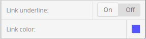
In some places links are self-explanatory and do not need different styling, for example in menus, or block titles. Here you can set the link colour matching the text colour, and switch off the ‘link underline’.
You have a convenient (WYSIWYG) text editor to add text, set paragraph format (heading 1-3 or normal) and styling options. You can activate it by double clicking on some text.
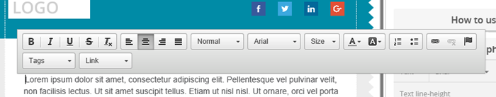
Use this tool to add links to the text.
It might be useful to add multiple text elements if you would like to have different text styles in your email template for example a quote, footer text or a promotional message.
The spacing of text is similar to the margin of a box or an image. Its role is to separate the text from other elements.
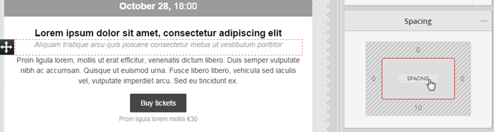
Similar to setting a margin or padding, you can set the spacing of the text on each side separately or set the same spacing on all sides by clicking on the ‘SPACING’ button.
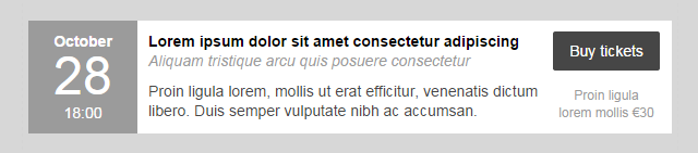
The button is the obvious place of interaction in your mailshot. This is the element which you would use as the main call-to-action (CTA) in your email templates.
The button is an important element, an so there are a variety of styling options available in the editor to help you create stunning and responsive buttons.
Note: Background images are not supported in most Outlook versions, so always have a background colour selected to show if the image does not.
Use columns to divide text horizontally.
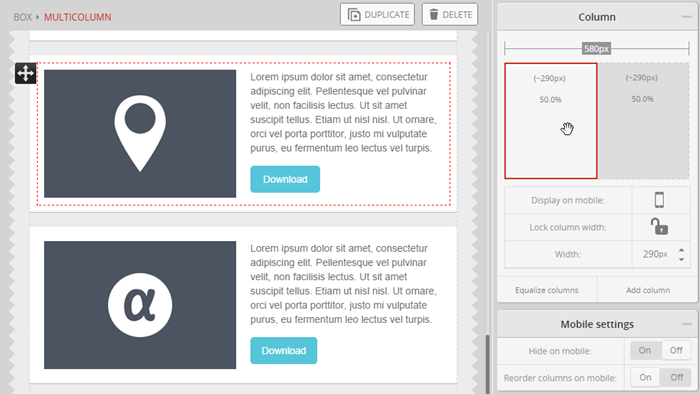
You can add up to five columns in a column set. The width of the columns is set in pixels for the desktop view. The relative width displayed in percentages allows the columns to adjust their size in different environments such as mobile devices or different email clients.
Columns can be rearranged by dragging and dropping them, equalised or deleted (if you have more than 2 columns).
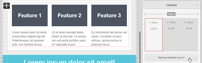
A column set adjusts its width to its container element (this can be a box or another column). Because of their relative sizing the columns can be viewed on smaller devices, keeping their ratio to each other the same.
When you are styling your columns you can lock the column width. In this case only unlocked columns will be resized on mobile, and the locked columns will remain the original size.
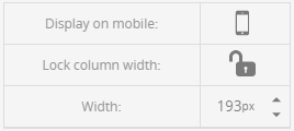
Note: Sizes are locked in % not in pixels.
If you don’t want a column to appear on mobile, you can simply hide it with the ‘display on mobile’ function.
Individual columns are by default reordered vertically on mobile screens.
In some cases (for example if you use small social icons) you may want to turn this behavior off. This can be done with the “Reorder columns on mobile” switch.
You can also choose to hide the whole set on mobile screens.
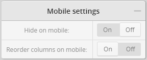
Image and Text
Table
Menu
Icons
Two Column Structure
The favourite element is a group of elements that you can save and reuse in other templates. For example, if you often use image and text next to each other, you can save that structure as a favourite element, so that next time you will not have to build it up again from scratch using column, image and text elements.
To make use of the favourite function select the containing box, scroll down to the ‘favourite element manager’ in the menu on the right, name your element and save.
Later you can drag and drop a favorite element from the top menu to your template and choose from your previously saved elements.
Note: this is also useful for headers and footers